


|
|
|
#42
 11-20-2015, 08:35 PM
|
||||
|
||||
|
Great jug!
__________________
PAPERENGINEER Designs in progress: -C-2A Greyhound -Br.1050 Alize 
|
|
#44
11-21-2015, 08:43 AM
|
||||
|
||||
|
No, I am sure my artwork will not please everyone.
Your comment is more than fair Gene. The last thing I want to do is make negative comments towards Gerardo. He does fine builds and has done plenty of builds for me. He's done fast builds when I need them, and slower high quality builds when time allows. This was obviously a quick build as I had requested. But I wish he hadn't have continued with the print quality as it is. Since its obviously very misleading if you don't read the explanations here. The OD Green is definitely OD Green...not gray as it is in Gerardo's print. The highlighting along the rivet lines is more subtle. I think it adds a bit more visiblity to the lines and adds some surface texture. (Lets face it, the skins on these planes were buckled and rippled and wavy) As I said, I try different effects with each model and this felt like an interesting textural effect. Its very hard to photograph and then show colours reliably on a PC, but I did a fresh test print of one of the wing pages to show the colours. Printed on a home Brother printer, aftermarket inks, 65lb Staples cardstock. Shot on my work bench, directly near my work light to produce a strong paper reflection. Move the sheet out of the direct light and the highlighting almost disappears!  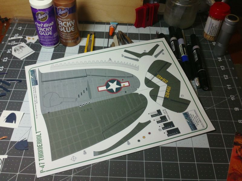
__________________
SUPPORT ME PLEASE: PaperModelShop Or, my models at ecardmodels: Dave'sCardCreations
|
|
#46
11-21-2015, 09:07 AM
|
||||
|
||||
|
But you are not forced to like everything I do with every model.
My experimentations will affect how each model is received. And some might not appreciate the changes I make. I'm okay with that. And I appreciate your honesty. I did my best to beef up the green colour and tone down the highlights in the photos that I added to the store listing (at ecardmodels). In this case, Gerardo's is the only representation I have for the store photographs. Thats why it has become a bigger concern for me. And why I am rambling on about this. I'll stop now. LOL Gerardo, if you are reading this...please don't think you did anything wrong. I am satisfied with your build...I understand the problems you had with paper and printing. I've experienced the same sort of thing.
__________________
SUPPORT ME PLEASE: PaperModelShop Or, my models at ecardmodels: Dave'sCardCreations
|
|
#47
11-21-2015, 03:15 PM
|
||||
|
||||
|
Cool looking model! Great build! Like the little "personality" effects/renderings on the hidden parts!
About colors; 1) I have three different color printers that I use or in the case of the Epson used to use. 2) They all printed the same model in different hues, when the ink hog Epson was still printing, it had the most vibrant colors, meaning deeper reds; brighter yellows. The other printers are wide format made by HP. 3) Both HP printers are wide format. One uses 4-ink cartridges, the big blueprint printer uses 6. 4) Three different ways to create color for printing: CYMK [Cyan, Yellow, Magenta, Black], RGB (Red, Green, Blue), sRGB. 5) Here is a short description: CMYK is subtractive, like paint/pigment. you start with nothing (white paper) and as you add more colours it eventually turns black. CMYK represents the standard coloured inks that printers use to create colours: cyan, magenta, yellow and black. RGB is additive, the way light creates colours. Better description- check this link: RGB versus CMYK 6) Most printers print as noted above, however Adobe PDF files use RGB or sRGB. In other words the colors are going to be converted at some point. To further change things, when creating PDF files you can modify the "color" saves to convert or keep the same. 7) My 24" wide format printer uses sRGB only. It will not print a solid deep black. It uses all 6-ink cratridges to print black. The final print black has a "green tint" to it. The 6-color cartridges are as follows: a) Black b) Yellow c) Light Magenta d) Light Cyan e) Magenta f) Cyan 8) Time to mention "Brightness" which is a paper term. All paper is tested underneath a certain type of blue light. The reflected light from this test is read by a light meter that measures "brightness". The higher the number the more white it looks to our eyes. A Brightness of 74 or 86, is going to look yellow when next to a paper with 96. Yes, this affects how ink looks when printed. What I'm trying to say is there are many variables that change how a model looks when printed from different printers and using different papers. (Using the word paper to mean paper and cardstock) Sorry, for the soapbox... Mike
__________________
Cardstock Property Tables and Terms Flying Cardstock Models http://www.papermodelers.com/forum/m...uers-projects/
|
|
#48
11-30-2015, 02:33 PM
|
||||
|
||||
|
Thank you very much, YankeeBoy, YOAV, Paperengineer, Gene K, and Mike Bauer!!
Special thanks to Dave Winfield for his efforts and contribution to the paper modeling world. Quote:
|
 |
| Thread Tools | |
| Display Modes | |
|
|


 Linear Mode

