


|
|
|
#1
 05-19-2014, 07:21 AM
|
|||
|
|||
|
Colour perception on small models
Besides people seeing colours differently printers and even computer screens can make colours appear different - it seem even GREY'S!
To minimize this I have a gadget called SPYDER Express to calibrate my screen to a colour standard and also this website: RAL and BS colour guides, cards, charts, swatches and books. It has colour chips for: RAL Classic, RAL Design, RAL Effect, BS 4800, BS 2660, BS 381C, BS 5252, Other BS Colours, NCS 1950 Australian Standard Colours, Pantone (PMS) Uncoated (U), & US Federal Standard 595. I would be very interested to know how you cope? if at all. Ron  or or ? ?

|
| Google Adsense |
|
#2
05-21-2014, 04:59 AM
|
||||
|
||||
|
I really should calibrate my screen and printer...
What I do with colours is that I generally grab a colour from a pic/web page using Colorzilla, an extension for Firefox. That's a nice website that's going to my bookmarks, at least the colour chart section. Thank you Ron.
__________________
Carlos
|
|
#3
05-23-2014, 08:21 PM
|
|||
|
|||
|
It's a real minefield.
Once calibrated my screen 'correctly', but everything I did just looked dark on other peoples computers, the printer printed everything out so dark you loose all the detail, even with the gamma on my printer maxed out. Nowdays the angle you look at the screen makes a big difference, you can tell who slouches in their chair...
__________________
ERM...
|
|
#4
08-08-2014, 09:35 AM
|
|||
|
|||
|
Hoho, what a topic! Hope you don't mind me chiming in, but colour perception for me is wholly subjective, and no amount of software etc will resolve anything! I say that because for a start, you are working (I assume) on a computer screen, so your image is backlit, unlike any solid object you will encounter 'in the flesh', so to speak.
For one of my UK outline railway locomotives I carefully sourced the 'correct' Brunswick Green, with the right 'code' for RGB (and there again, are you designing for RGB or CMYK printers, inkjets or laser???) and the colour looked completely and utterly wrong when printed out. I took sample colour chips down the local printers and they were different again. Any 'real' object, when viewed from a distance where it's small enough to look like a model will anyway be a lot lighter in colour than if you walked right up to it, due to atmospheric haze, moisture, sunlight etc etc. And who knows what the colours on, say, that WWII Messerschmitt really looked like in WWII? Not like that weathered and aged piece you took a picture of in a museum (which is soaked in sodium light anyway!!) It is a minefield, but if your model looks nice when built, I'm not sure too many builders will be overly worried if the colours are 'correct' :-) And I will share a curious story. My Dad built me a plastic Stuka when I was about 7 (a long long time ago) and he used some of the same green as on the front door of our home. It always looked wrong to me, but decades later, it proved nearly the right shade. As he witnessed the Battle of Britain from his boyhood home in Kent, I guess he should know :-) Plumdragon
|
|
#5
08-08-2014, 07:14 PM
|
||||
|
||||
|
Colour, like beauty always lies in the eye of the beholder. Try as we might colours will always be different for me and many other guys due to our own level of color blindness. I try not to worry about too much and if I'm really in doubt I just ask the wife.
Curt
|
| Google Adsense |
|
#6
08-08-2014, 09:24 PM
|
||||
|
||||
|
Quote:
I just replaced my old printer. It was a high end Epson using 5 color and 2 black cartridges and the photo printouts were outstanding, but PDF printouts of models was average at best. Even scanned images did not printout looking like the original. I purchased a midlevel HP Photosmart all in one printer using 3 color and 2 black cartridges. The first thing I noticed was that scanned images printed out very nearly identical to the original. After some tinkering I found the card stock to be causing the very small differences. Now I have three devices that were color synced, I count the paper as one of the items. Then it was just a matter of using the color profile for my monitor for the win 7 environment and Corel Draw suite that I am now using. the result is what I see on the screen is what gets printed. If I use the Illustrator version that I have the colors will be off, printing from word is very close but still not correct. I believe this is due to the versions of these programs. Illustrator is a pre win 7 version and I am using office 2007. The Corel x6 suite I use is specifically for Win 7. My conclusions is that not only the hardware but the software you are using will affect the colors of your models. And don't forget the paper use the brightest paper you can get. Ron pointed out something few people realize. People perceive color differently. my left eye sees much higher color frequencies (purple and blues) then my right eye due to a lens implant. so maybe I need to calibrate my eyeball now. Jim Nunn
__________________
There is a very fine line between paper modeling and mental illness.
|
|
#7
08-08-2014, 09:27 PM
|
||||
|
||||
|
I use two monitors for a larger work area, multiple windows, etc
Trying to match these two monitors in colour, contrast, tone, is impossible! I have tried and tried again, it just can't be done. It might help if they were both the same type of monitor, but I'm sure it would still be difficult. Even if it could be done, it has no effect on the actual colours that come out of each and every printer that is used to print one of my models. Anyway, I gave up trying to judge colours by whats on my screen. I have various printed charts and reference items on hand at all times. Some of them hanging on the wall behind my monitors. Including Colour Charts and test swatches for models I am working on at that moment. When sorting out colours in a model, I print out new test swatches to choose from. I always test print selected part and pages of my models to test the output. And anything I am unsure of gets printed to test colour, contrast, and overall appearance. Thats how I "calibrate" my monitor for design work. 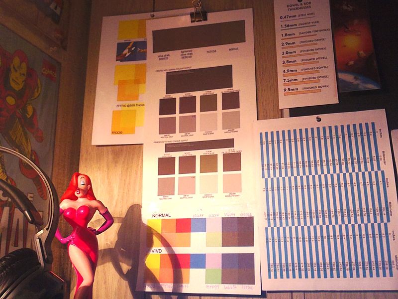
__________________
SUPPORT ME PLEASE: PaperModelShop Or, my models at ecardmodels: Dave'sCardCreations
|
|
#8
08-09-2014, 07:55 AM
|
|||
|
|||
|
Still in love with Jessica I see....
__________________
This is a great hobby for the retiree - interesting, time-consuming, rewarding - and about as inexpensive a hobby as you can find. Shamelessly stolen from a post by rockpaperscissor
|
|
#9
08-09-2014, 12:16 PM
|
|||
|
|||
|
Airdave - Jessica Rabbit aside (although I can't fault you there
 printing colour swatches is a great way to work, although time consuming! Naturally, in time, a large 'stock' of colours is collected, and I've found that colours that are 'off' for a certain project may happen to be spot-on for another. In the e-world of computer design, just like the 'real' world of p*a*t*c modelling, it pays to never throw anything away :-) printing colour swatches is a great way to work, although time consuming! Naturally, in time, a large 'stock' of colours is collected, and I've found that colours that are 'off' for a certain project may happen to be spot-on for another. In the e-world of computer design, just like the 'real' world of p*a*t*c modelling, it pays to never throw anything away :-)Plumdragon
|
|
#10
08-09-2014, 01:32 PM
|
||||
|
||||
|
What you see in those photos, are not the "swatches" I print out when working on a model.
Its a very quick and simple process. If, for example, I am doing a "Marines" AT6 texan Air Racer that is a deep navy Blue colour with yellow stripes...and its obvious that these are not standard military colours... then I'm going to pick two colours that I think will work, maybe add a couple of alternates (lighter and darker maybe) and then print out a quick sample sheet....showing the colours...before I get too far with the design.. Sometimes, its an actual model page, so I can also judge the colours with the rest of the artwork, or it might just be some borderless squares with various colour samples (swatches). But, I do this fresh...new printouts with every new design. Its pays to have a good working printer that uses cheap ink. No more HP printers for me!! The "Yellow" sheet (partially hidden) was a session of me trying out a few options for Trainer Yellow - or ID yellow, Chrome Yellow, Deep yellow, whatever you want to call it. I don't like the really orange yellow that seems to be the common option for ID yellow. My Corel colour pallette has a "deep" yellow that seems to work well. Proper ID/Trainer Yellow is more orange ...but at scale size it can appear too deep. Not to mention the problem of some printers printing out way too much orange. So, I do a little colour experimenting on the screen, come up with a few options and then print out a sheet of swatches to test the printer output. I put RGB and Hex codes next to each colour and compare the printout to some photos. This is a good sheet to keep for future reference, with Yellows that I know will work. And then I can ignore all those colour codes found online that are supposed to be correct, but rarely are! The longer sheet to the right is another similar example where I was testing Olive Drab printouts. The sheet has 14 different Olive Drab options, including an actual swatch from Pittsburgh Paint. A supposed sample of their 1940 Olive Drab, applied over primer on steel. Theres also some aircrcaft grays that I use regularly. Since I use O.Drab a lot, it makes sense to keep that sheet handy. The swatches at the bottm are just a test of the Normal and Vivid settings on my Printer. I printed some common colours and then reprinted them side by side on the Vivid setting to see the difference. I think its important to know the settings in your own printer and how you can adjust things...and not just let everything run on "default".
__________________
SUPPORT ME PLEASE: PaperModelShop Or, my models at ecardmodels: Dave'sCardCreations
|
| Google Adsense |
 |
|
|


 Linear Mode

