


|
|
|
|||||||
| View Poll Results: Gray chart for SR-71 Build | |||
| A - True Black |
|
10 | 15.38% |
| B - Gray #1 |
|
16 | 24.62% |
| C - Gray #2 |
|
29 | 44.62% |
| D - Gray #3 |
|
5 | 7.69% |
| E - Gray #4 |
|
1 | 1.54% |
| F - Gray #5 |
|
1 | 1.54% |
| G - Gray #6 |
|
0 | 0% |
| H - Gray #7 |
|
0 | 0% |
| I - Gray #8 |
|
3 | 4.62% |
| Voters: 65. You may not vote on this poll | |||
 |
|
|
Thread Tools | Display Modes |
|
#1
 06-30-2010, 08:47 PM
|
||||
|
||||
|
SR-71 Color Poll
Okay, Gang... Here is Ken's test card for the poll
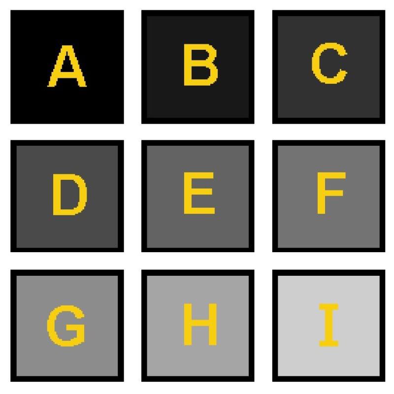 I edited it just little to make it more of a blind test. Select the letter you think is the right shade. Discuss or post comments only about color in this poll thread, so as to not clutter up the Design/Build thread. Thanks! 
|
| Google Adsense |
|
#2
06-30-2010, 09:43 PM
|
||||
|
||||
|
Well just to throw a monkey wrench in your machine and I have no definite reference for this but I think I heard somewhere that there is some noticeable blue in the blackbirds paint?
__________________
Paper model designer turned aircraft designer. My models available for sale @ Gremir and Ecardmodels
|
|
#3
06-30-2010, 10:18 PM
|
||||
|
||||
|
The only SR71s I have seen are in the Blackbird Air Park in Palmdale, Ca. The finish is a velvet matt finish not black but a shade or two towards the gray side. And yes there is a tint of blue but I think that comes from adding white to the flat black color.
Now as for which color in your samples is the closest. I have to say it will depend on which monitor I am using. I run dual monitors on my system both are Samsungs but not the same model (B2330 and a 2253BW) the differences are quite noticeable but I would go with B on the 2330 and C on the 2253 which is the better of the two monitors. My point is both monitors and printers vary in color reproduction. I would suggest that you use a dark gray due to scale color effect and it should be light enough that panel lines are not lost in the dark color. Jim Nunn
__________________
There is a very fine line between paper modeling and mental illness.
|
|
#4
06-30-2010, 10:50 PM
|
||||
|
||||
|
Quote:
" Payne's gray - any pigment that produces a greyish to dark greyish blue"
|
|
#6
07-01-2010, 03:15 AM
|
||||
|
||||
|
Looking at my computerscreen I would say B or C, but the real problem is the printer and the software you'll print from.
I started printing from the 'Preview' program on my Mac, with my Canon printer,setting the paper to matt-gloss photopaper, and high quality, and it accidentally came out looking good, after Ken's remark I started experimenting.. When I printed it from my HP printer, using the same program it came out pitch black and the lighter grays were more blue-ish Printing from Photoshop on the Canon printer it came out different again, real black with a nicer contrast. Printing from the Preview program, on the Canon printer with the colour setting on highest contrast and saturation made it darker ,but still is this warm chalky not completely black... Printing from Adobe Reader on the Canon is somewhere in between with sill a touch of red in the not completely black The print from Photoshop looks the best, and is probably the closest to Ken's original Think I'm lost in the dark for now....
|
|
#8
07-01-2010, 06:01 AM
|
||||
|
||||
|
Gentlemen: I might point out that I did mention somewhere (in the other thread, I think) that ALL monitors and printers vary in their output. Therefore, you should PRINT out the card, and make your selection from that printed copy.
|
|
#9
07-01-2010, 06:09 AM
|
||||
|
||||
|
How about doing the prototype A-12 that did the first few test flights. It was left bare titanium, until they discovered that painting it (dark indigo blue) actually helped in cooling the skin.
That way, rather than helping out the printer ink industry, we can make Red River paper happy :P
|
|
#10
07-01-2010, 06:12 AM
|
||||
|
||||
|
I believe C would be best. It allows for panel lines to
show if they are printed in true black. The slightly lighter color would most likely show better on all the different printers and inks with not as much variation in the color output. Ron
|
| Google Adsense |
|
|
|


 Linear Mode

