


|
|
|
#1
 08-15-2010, 06:56 PM
|
||||
|
||||
|
USS Lehigh monitor
Since CT hasn't released any new models in days, I was forced to turn sides and build up a Union ironclad, the USS Lehigh. The model was designed by Magnus Morck and is a free download from here:
MySpace - Magnus Mörck - 59 - Male - Göteborg, SE - myspace.com/mmpapermodels I printed this model out using a laser printer, which made the model completely black (but with nice printing). Laser printed pages are a lot more difficult to work with than dot-matrix documents, since the color falls off it at the slightest bend. Not my cleanest build, but I thought I would share the results. The model is a bit more complicated build than the USS Monitor available from Paper Shipwright. For example, the turret is captured between the top and bottom deck pieces so it can't fall off. There's a few changes I would make if I had to build it again. I would remove the markings on the deck for the anti-torpedo nets. I left the nets off so the model wouldn't take up too much space in a display case. The hatches are very rudimentary, some depth could be added without much effort. I'm not sure what Mr. Morck was trying to represent by only doing a partial drawing of the armour plating on the deck, but the white detailing needs to be toned down. Also, the deck "blue dots" representing lighting lens seem to be too randomly placed (what do you think, Avery Boyer?). A couple of nice touches showing Mr. Morck's humor are the deck chairs and "WC", along with the free tug, the Clyde. 
|
| Google Adsense |
|
#2
08-15-2010, 07:08 PM
|
||||
|
||||
|
There was really no method to the madness when it came to placing vents/light ports on these ships. The philosophy seemed to be "as many as possible, where ever possible" presumably since the interiors were very very cramped and stifling. That being said, based on a quick check of my references, the pattern represented on the Lehigh kit only loosely follows the pattern on the real ships. I don't have much specific to Lehigh, but the ships were at least initially almost identical.
I don't think accuracy was what he was going for, I think just toning down the light ports would be enough to improve the appearance. I think gray or black would be better than the blue. I see a number of other things that aren't right, the boat should be white, the hatch coamings should be black to match the hull, and so on. But the overall effect is good none the less, and your build up is excellent. I really like the tug, and the side by side with Monitor. Shows how much of leap forward the Passaics were. Last edited by APA-168; 08-15-2010 at 07:34 PM.
|
|
#3
08-15-2010, 07:16 PM
|
||||
|
||||
|
Oh no, a USS Ship!
 Very nice work as always.
__________________
Jay Massey treadhead1952 Las Vegas, NV
|
|
#4
08-15-2010, 08:27 PM
|
||||
|
||||
|
Thanks for you inputs, APA-168. I figure you are the expert on these monitors.
Don't worry treadhead1952, CT has come through for my addiction once again, and a new Confederate ironclad is on the way.
|
|
#5
08-15-2010, 09:27 PM
|
||||
|
||||
|
Looks pretty good. I really like the tug.
I scratch built USS Monitor (initial pre-modded design) sometime ago on her the skylights were more numerous and smaller. It could be that follow-on designs were changed to eliminate the numerous design flaws of the original. USS Monitor 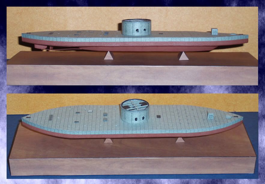
Last edited by B-Manic; 08-16-2010 at 08:59 AM.
|
| Google Adsense |
|
#7
08-16-2010, 10:16 AM
|
||||
|
||||
|
Yes. I, for one, miss him. Try to support the site which is maintained by his son in memory.
Lep
__________________
"TANSTAAFL" - "There ain't no such thing as a free lunch!" Lazarus Long AKA Robert A. Heinlein
|
|
#8
08-16-2010, 10:38 AM
|
||||
|
||||
|
I miss him too, he was a very talented designer and he did a lot of interesting ships. And of course, he was enormously generous and by all accounts a very modest man.
|
 |
|
|


 Linear Mode

