


|
|
|
#1
 10-27-2018, 10:10 AM
|
||||
|
||||
|
Scale Model Colours
Note the following and tables are from the documentation I have prepared for use elsewhere and is copyright - please do not copy or repost the text without my permission.
A: INTRODUCTION Remember the Colour Perception Effect and the related saying that nothing spoils a model more than the careful application of the correct colours. There is often frequent discussion on the correct or accurate colours for a model. By this people are generally referring to an accurate colouration of the model based on the prototypical colours or schemes. The source of the prototypical colours can be museum items, colour photos, official colour schemes (these in turn are based on standard colour chart values) and so forth. But in reality (bad news for rivet counters), there is no such thing as the correct/accurate colour. Either on the real item or for a model! B: COLOUR PERCEPTION No such thing as the correct/accurate colour for a model - why is this? Well, the main reason has to do with our eyes and the perception of colours in relation to various conditions and distance. This effect is well known to artists and military specialists involved in the development of camouflage. The main point is that the same object viewed at say 5 metres, 15 metres, 30 metres etc will appear a different colour at each distance. As colours get further away they dull and become a lot softer and lighter the Scale Colour Effect. But it is a fraction more complicated then this - the scale colour effect is directly related to .....
The Dimensions of Colour, modern colour theory D: AN ILLUSTRATIVE EXPERIMENT If you are not convinced about colour variation due to distance, try the following experiment and you soon will be!
E: COLOURS ON THE REAL ITEM. Another thing to consider in terms of realistic colours is the actual real-life colour on the real item. Real life never corresponds to the colour charts and paint chip specs! Or t museum or airshow examples. The colours all become heavily modified over time due to:
F: SOME THOUGHTS ON MODEL COLOURS The colour on a model can look accurate or it may have another appearance (that often enhances the finished model). A good example of the latter are architectural models which range from models with bright colours to weathered items. Which are better? It really does not matter its a matter of taste, perception and what a person likes and thinks looks good. It is also related to the artistic style of the designer. In the case of your models deciding on the colours should be easy if they look right then use them. Finish. Dont worry about trying to match the real hypothetical colour the real thing when you look at it will not in any case match the colour swatches that are meant to be used! Dont worry about what other people may think or say! G: PAINTING PAPER MODELS WITH A DRAWING PROGRAM OR PHOTO EDITOR When colouring models there are a few simple things though to watch for:
One thing these programs all have in common is the feature of being able to choose a colour either visually or by entering in the colour value using the standard colour formats CMYK, sRGB, Lab, HSL or Hex. Some programs also allow you to enter in a number for the light reflectance value these affect the appearance mimicking a gloss to matt effect. If you dont have a light reflectance value setting, opacity adjustments can be used. So, if you know the colour value, start by entering it in. If it is in sRGB and the program only appears to accept CMPK or something else, check your settings. These can be using be changed to match the particular type of colour values you want to use. You now have the real colour in. The next step is to lighten it. Again, if you look at the colour settings for the colour you now have, you will find you can adjust the colour choice via a colour circle a colour slider or colour swatches. Use this to lighten the shade you have chosen. You will also have the option to adjust the colour using sliders this is where you can make adjustments to black or white, by bringing in a shade related to a neighbouring colour. Using layers, and the opacity of these you can also make further adjustments overall or to just select areas. Play around there is lots more you can do! H: A REAL-LIFE EXAMPLE OF COLOUR VARIATION Lastly, I thought an example would be nice of how colour variation does really occur in real life. Background a small war I served in, and from which I still have actual reference material some official, some colour chips, notes etc. Topic - a look at a Dakota. Subject - various:
Here are the colour swatches. Problem was that the paint was often of poor quality and also subject to harsh service conditions. As a result, I never saw a Dak with the correct colours instead they were all sorts of colours. Have a look at the following pictures and dont worry too much about the colour gradients and the actual colours the thing here to look at are the shades and contrast between the camo patterns. All the aircraft were in service. Picture 1 shows the recommended colours. Picture 2 is a similar side view of the real thing on stand-by and ready to go. Note in this picture all the colour variations on the dark earth and green, as well as the effects due to overpainting existing camo that are now coming through. Now, look at Picture 3 below. This is classic three Dakotas all with the same colour scheme Dark Earth and Green camo!!!! Picture 4 again different shades of camo coming through, but even allowing for photo and light variations, clearly something a bit odd as well in relation to the colours that were used. CONCLUSION So there you are you are making a model and the recommended colours are as per Picture 1. But what colours are you going to make the model so it looks realistic because the real ones never looked like Picture 1 even though they used those colours! If you look at any pictures of aircraft in actual service, you will generally find something similar to a greater or lesser degree. The answer I guess is to use your artistic abilities the best you can so the finished item "looks right"! Note the following and tables are from the documentation I have prepared for use elsewhere and is copyright - please do not copy or repost the text without my permission.
__________________
The SD40 is 55 now! 
|
| Google Adsense |
|
#2
10-27-2018, 10:43 AM
|
|||
|
|||
|
Thanks Kevin, that is a very informative. I have always informed my clients that colors are relative to the situation, you can match them perfectly but once you take them into the sun all bets are off.
I have always thought that most restored warbirds are painted incorrectly using high gloss paint. The last thing you want on your plane is something that reflects light and makes it more visible. The highly polished aluminum finish on planes is only for show, that would never happen in a combat environment. Mike
|
|
#3
10-27-2018, 10:43 AM
|
|||
|
|||
|
Amazing post. Lots of usefull information. Thank you for sharing here.
|
|
#4
10-27-2018, 07:28 PM
|
||||
|
||||
|
Many thanks for this exceptionally informative and useful illustrated essay, Kevin. It is clear that you put a great deal of thought, research, and effort into this, and I certainly appreciate your sharing it.
Don
|
|
#5
10-28-2018, 03:13 PM
|
||||
|
||||
|
Mike, Bigpetr and Don - thanks very much for your positive comments. I am glad you found the article of interest. It makes the effort of writing it worthwhile!
------------ Mike, your input is interesting as well, especially coming from a professional painter who deals with the real life issues. Your comments on the gloss paint for warbirds is spot on. During the Second World War the RAF did extensive studies on the issue after a gloss paint was shown to (sometimes) improve performance. Despite this, matt was the finish of the day for camouflage schemes, and they eventually went on to get the best of both worlds by developing a low coefficient drag matt paint!
__________________
The SD40 is 55 now!
|
| Google Adsense |
|
#8
10-29-2018, 12:26 PM
|
|||
|
|||
|
Somewhere I have a book giving the percentages and which colors to use to tone down the colors for each scale you are painting.
I'll look for it, unless someone knows what book it is. Cheers, Bob
|
|
#9
10-30-2018, 05:18 AM
|
||||
|
||||
|
Bob, thanks for this. The title of the book would be interesting - assuming that finding it is not a mission! So please post it or the percentages if you find it.
--------------------------------------------------------- There are some pretty consistent lightening tables used by plastic modellers - I attach the most common percentages I have seen suggested below in Picture 1 (ex Fine scales Modeller, IPMS, Scale Models etc.). I am not certain how plastic modellers mix to such accurate percentages (23%!), and the results would also vary depending on using the colour you use to lighten, which sort of negates all the exact precision, as you would need different percentages for each shade! As well as white, greys, tans and flesh colours are good lightening colours used for actual model paints. For paper modellers, however, they are sometimes useful as an indication of the strength of lightening that may be required In terms of "painting" a paper model via an editor, I use the Materials Palette (see Picture 2 below) that shows the toned colour and the slider. to lighten the shade as required. Clicking on the toned colour palette - (1) in the picture below will show the RGB numbers (or whatever swatches you are using) - same with the slider (2). The original colour can be entered in and then lightened in the toned palette. The two small boxes on the right shown the foreground and background, and at this stage, I used them to compare the colour shades as I work the variations. However, something more useful in these palettes is the ability to use the palettes colour picker to extract or copy a colour from somewhere else. Assuming that the colour settings of your screen are reasonably accurate (another story!), you can clone a colour directly from a prepainted article, a painting or a photograph. Not only does this give you the ability to find out what a colour is exactly in terms of its swatch number (RGB scales etc), but you can also copy the exact colour from place to place. In terms of colour photos, you can bring the colour and then use it as the starting point for adjustments as you wish. All reasonable editors will have the above functionalities.
__________________
The SD40 is 55 now!
|
|
#10
10-30-2018, 01:19 PM
|
|||
|
|||
|
Color perception has always been an area of interest to me, especially when applied to scale modelling. This is a great write-up, thanks.
Of particular interest to me is how easily context, or environment, changes our perception. One popular example is this illusion: 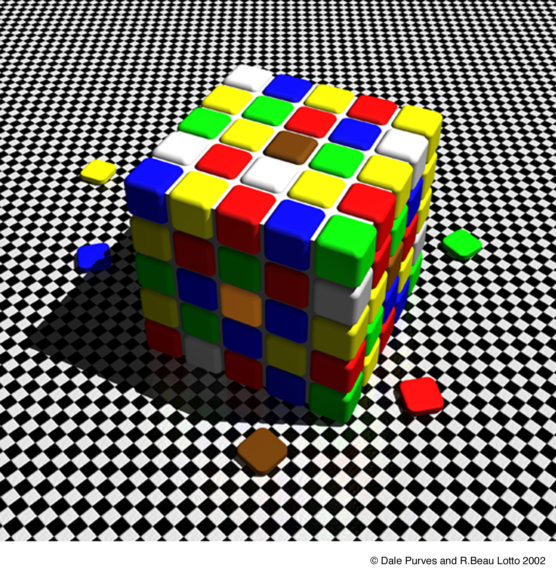 As crazy as it might seem, the center squares on the side and on the top are actually the same color. As it applies to scale modelling, my dad, an HO train modeller, loves to tell the story of how someone brought a model that was painted with the actual paint of the real locomotive, and yet almost everyone complained that it was the wrong color.
__________________
Current builds: Mirco Firefly Serenity 1:96, Saturn V 1:72 ADD victims: WM Columbia 1:100, AXM Atlas V 1:300, OBP Spruce Goose, Uhu02 X-Wing... and many others
|
| Google Adsense |
 |
|
|


 Linear Mode

